We Bought the House Knowing It Needed Everything—And We Were Really Excited About That
Most people walk into a house with old flooring, no appliances, and a half-sunken bathtub and think, “Nope.”
We walked in and said, “Perfect.”
From the start, we knew this place was going to be a full-gut, top-to-bottom, take-it-down-to-the-studs kind of project. And honestly? That was the whole point. We weren’t looking for move-in ready, we were looking for a blank canvas (with a few cracks, leaks, and suspicious smells, sure).
At Kaage Homes we spend our days helping other people reimagine their spaces, so it felt right to take on a renovation of our own. But let’s be clear: this wasn’t some quick flip or cosmetic refresh. This was months of demolition dust, unexpected “surprises” behind the drywall, and a whole lot of “we could save money here, but wouldn’t it be amazing if…”
Here’s how we transformed our house, room by room, into a space that feels like home and shows off everything we believe good design should be.
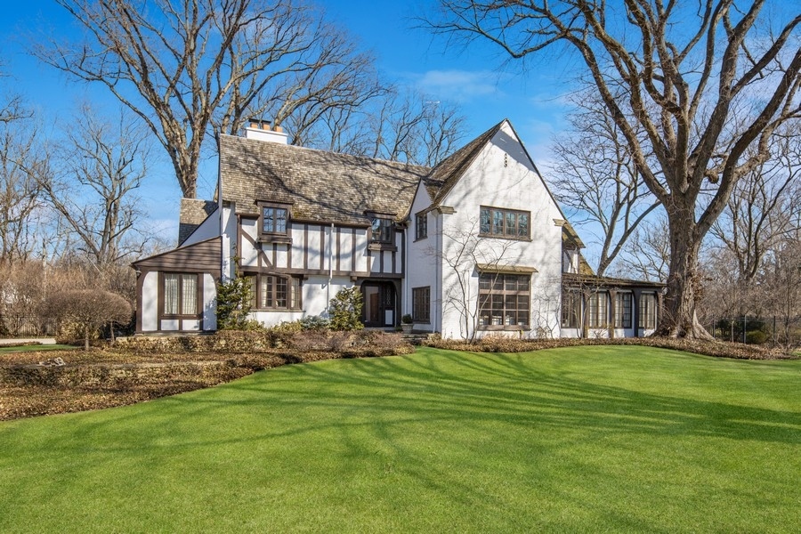
Project 1: The Exterior
Before:
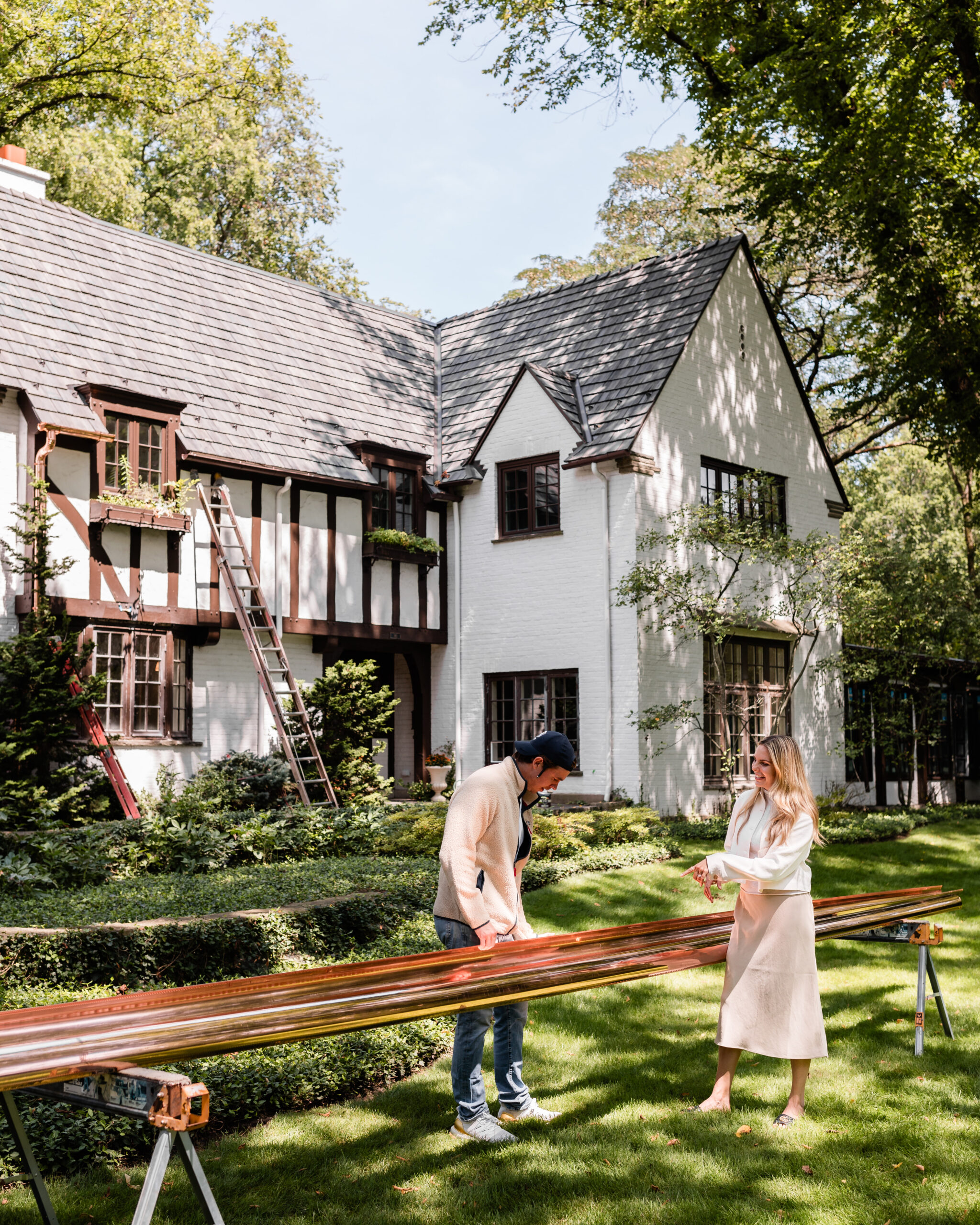
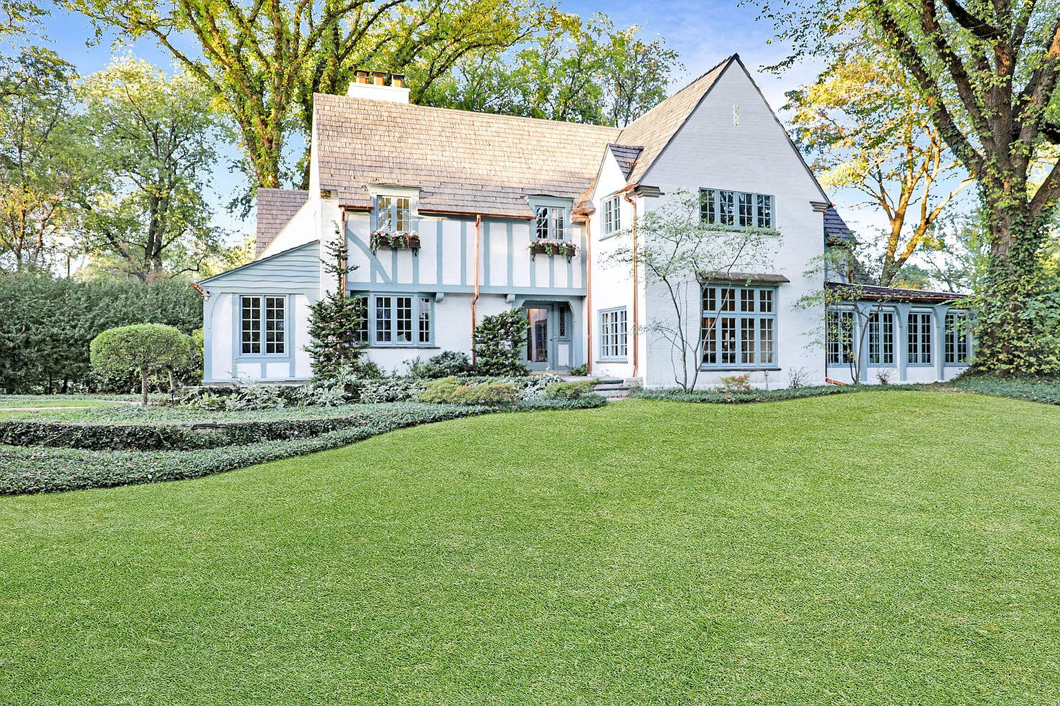
The exterior had seen better days — a worn roof, broken gutters, tattered paint, and overgrown landscaping told the story of years gone by. But the potential was impossible to miss. The structure stood solid, with timeless lines, well-placed windows, and just enough original charm to build on. It wasn’t welcoming yet (unless you count peeling paint and patchy grass as curb appeal), but it had all the makings of a beautiful front face to the home.
After:
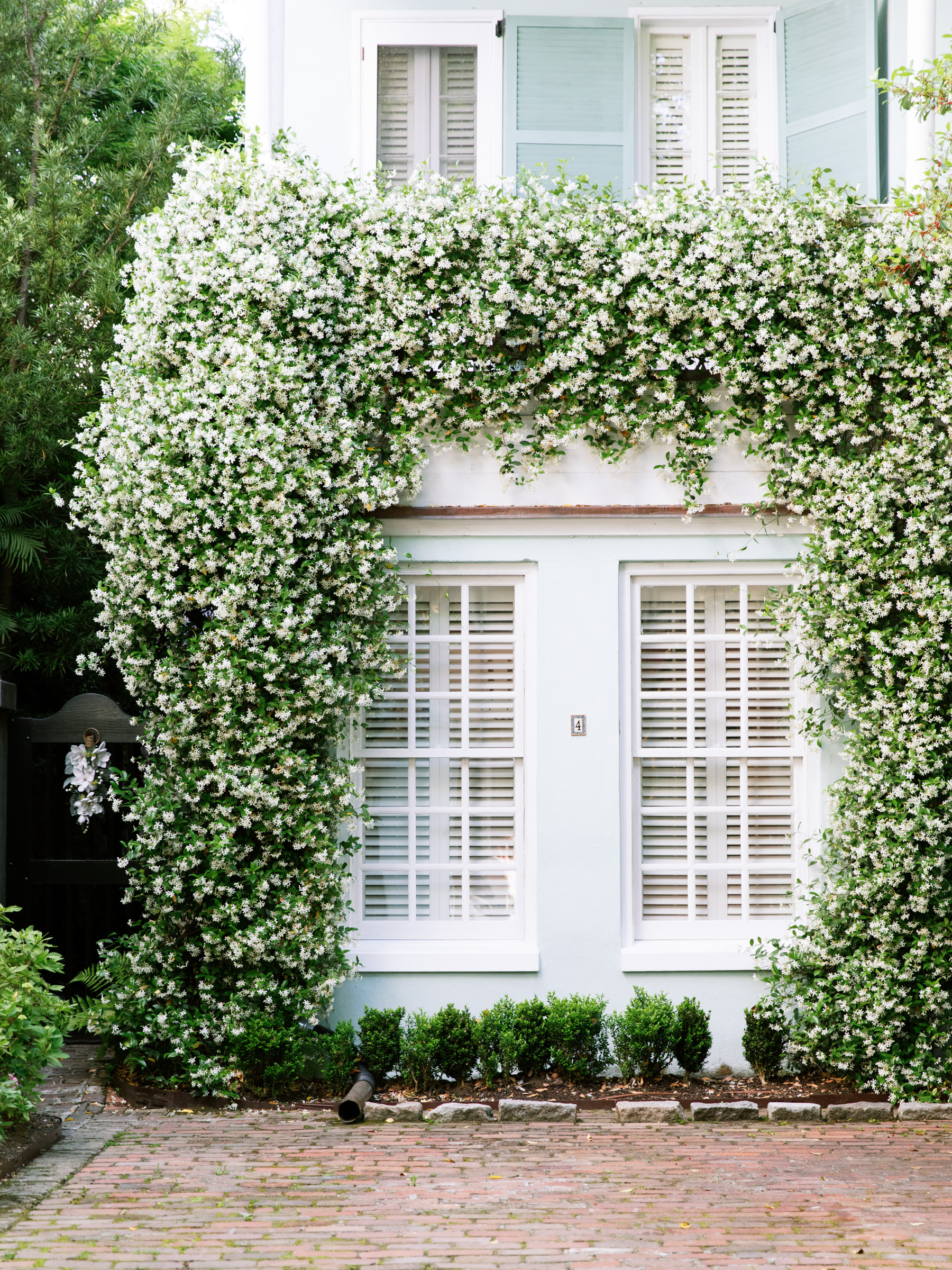
We reimagined the exterior to feel both refined and welcoming. A fresh coat of Farrow & Ball paint brings out the home’s natural character, while new copper gutters add a hint of elegance and shine. Lush, thoughtfully refreshed landscaping softens the structure and frames it beautifully, and window flower boxes lend a pop of charm and color. The result is a classic, inviting façade that feels cared for and complete, a true reflection of the home within.

Design Highlights:
- Fresh Farrow & Ball exterior paint
- New copper gutters with classic appeal
- Updated landscaping with added flower boxes
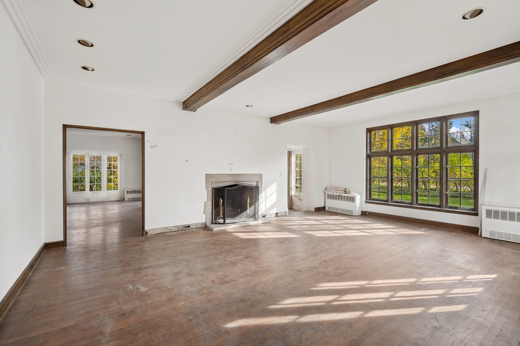
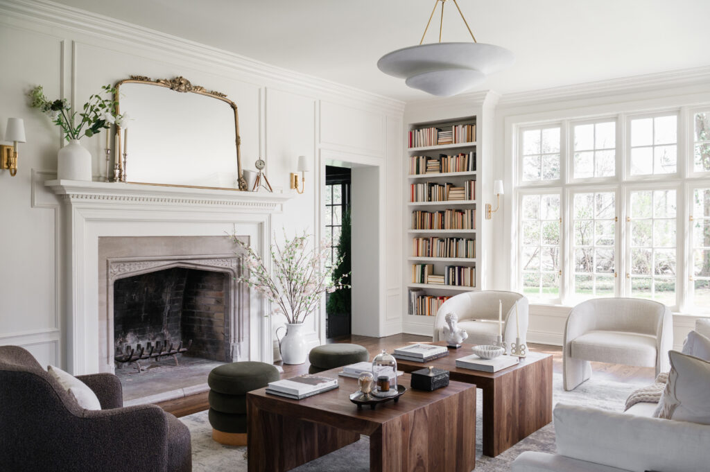
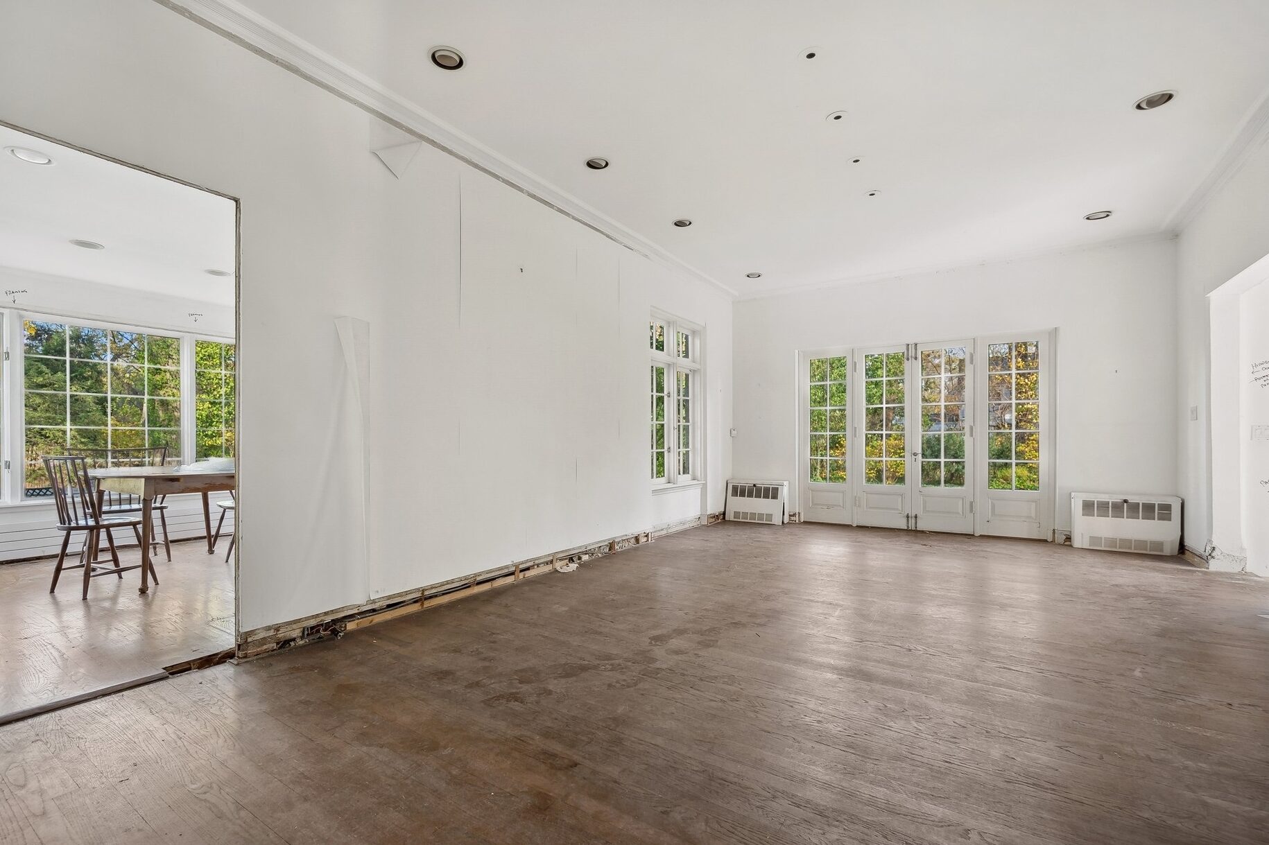
Project 2: The Living Room
Before:
The living room was down to the studs, but the good bones were impossible to miss. Generous windows, solid proportions, and an original fireplace with just enough character to build on. It wasn’t cozy yet (unless you consider exposed framing and subfloor ‘cozy’), but it had the raw potential to become the heart of the home.
After:
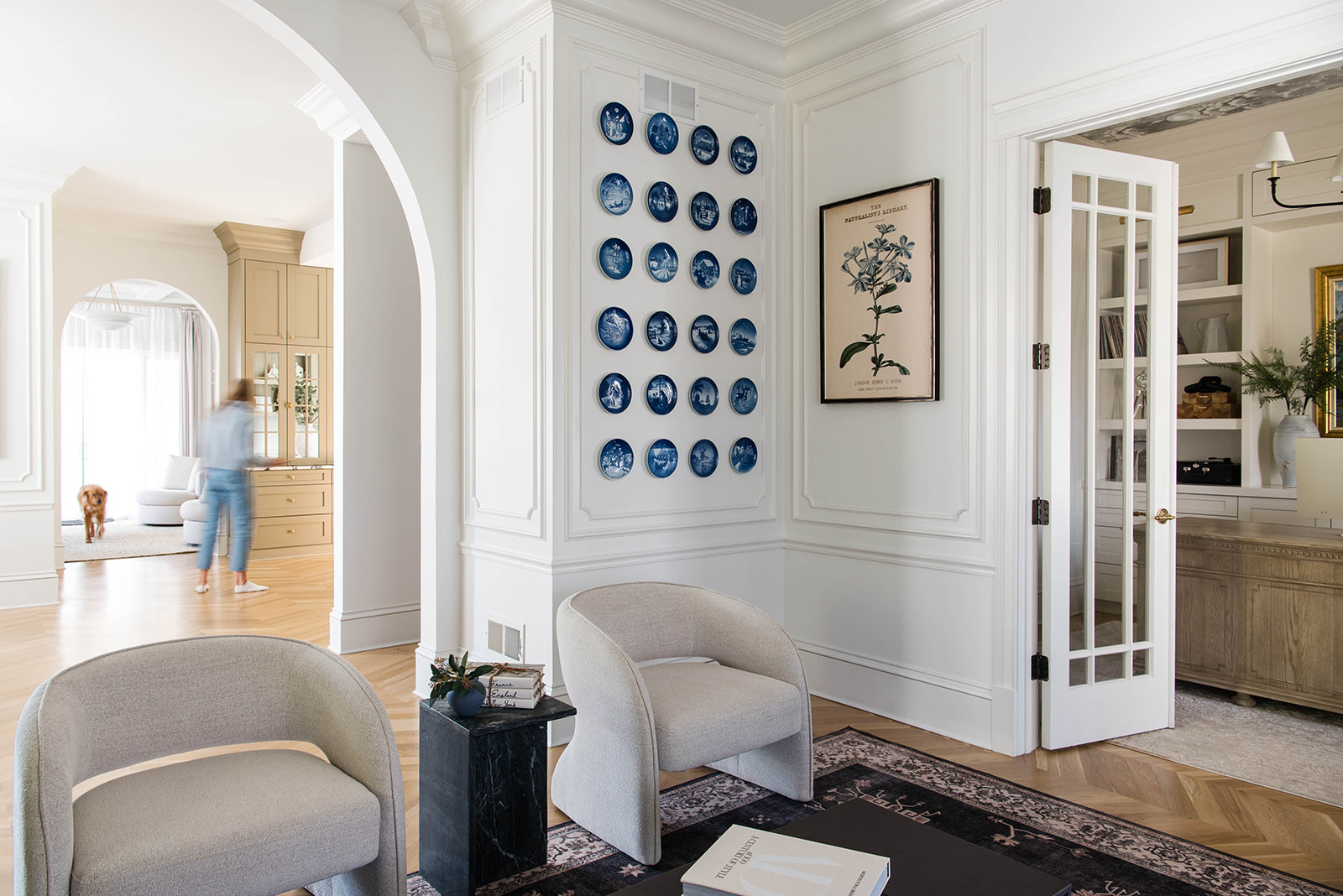
We reimagined the living room as a space that feels both elevated and inviting. Custom built-ins now frame the windows, adding function and architectural interest, while new molding on the fireplace and walls brings a sense of timeless character. Layered, cozy furnishings and a warm, tactile palette pull everything together, making it a true gathering space that feels grounded and welcoming.
Design Highlights:
- Meticulously restored original fireplace, preserving historic character
- Custom built-ins crafted for both form and function
- Newly installed moulding to enhance architectural detail throughout
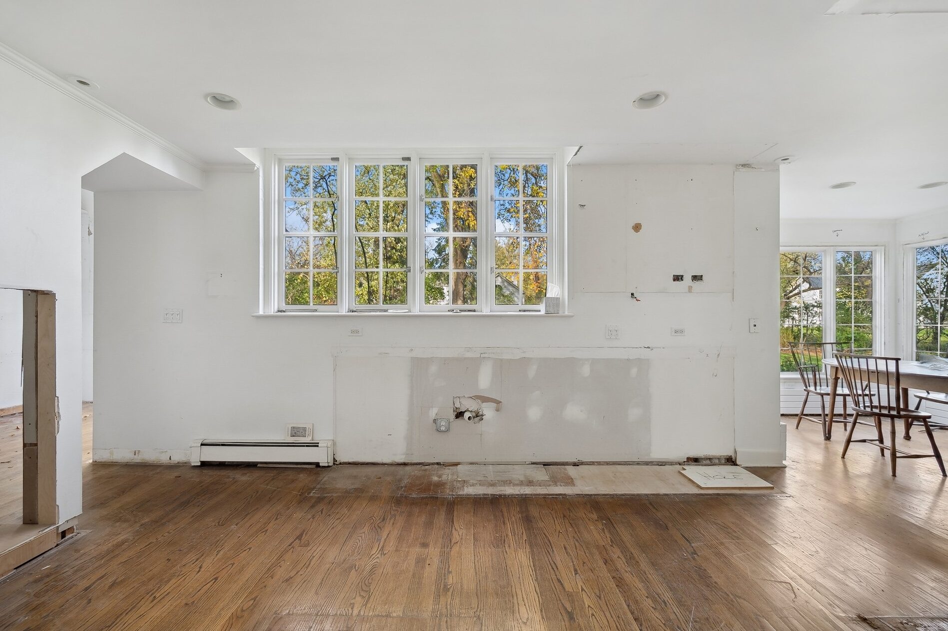
Project 3: The Kitchen
Before:
When we bought the house, the kitchen was already stripped to the studs—no tile, no cabinets, no charm. Just a blank box with a layout that made zero sense. It was completely disconnected from the rest of the home, which made any hope of open, connected living feel like a far-off dream.
After:
We reimagined the entire footprint. We sealed in the back wall to enclose the kitchen, added a large La Cornue oven, and tucked all the appliances into streamlined custom cabinetry and panel ready appliances. Now, it feels seamless—equal parts hardworking and magazine-worthy. Bonus: you can cook and chat with guests without shouting around corners.
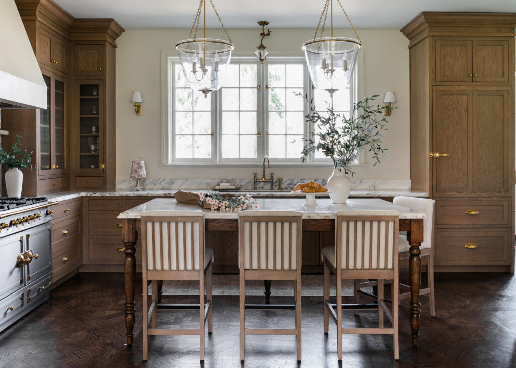
Design Highlights:
- Custom-herringbone flooring, designed and manufactured exclusively for this project
- Full-height oak cabinetry
- Seamless panel-ready appliances
- Statement island with built-in seating
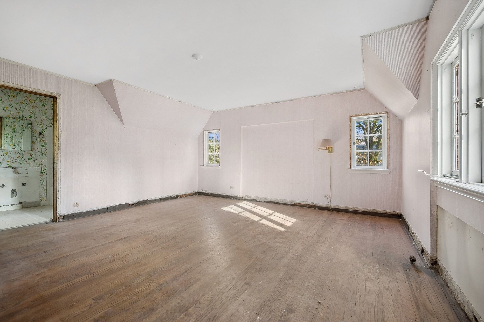
Project 4: Kids Bedroom
Before:
Our daughter’s bedroom had great potential, a charming footprint with sloped ceilings and plenty of natural light, but it needed some thoughtful design to bring it to life. The lack of molding left the space feeling a bit unfinished, and the attached bath was completely unfunctional. We saw it as the perfect opportunity to turn an almost-there space into something truly special.
After:
This space was transformed into a true retreat. We softened every surface with calming tones, warm textures, and playful furniture that reflects our daughter’s personality. In the ensuite, we added classic panel moulding, a spacious walk-in shower, and a custom oak vanity that turns daily routines into a little everyday luxury.
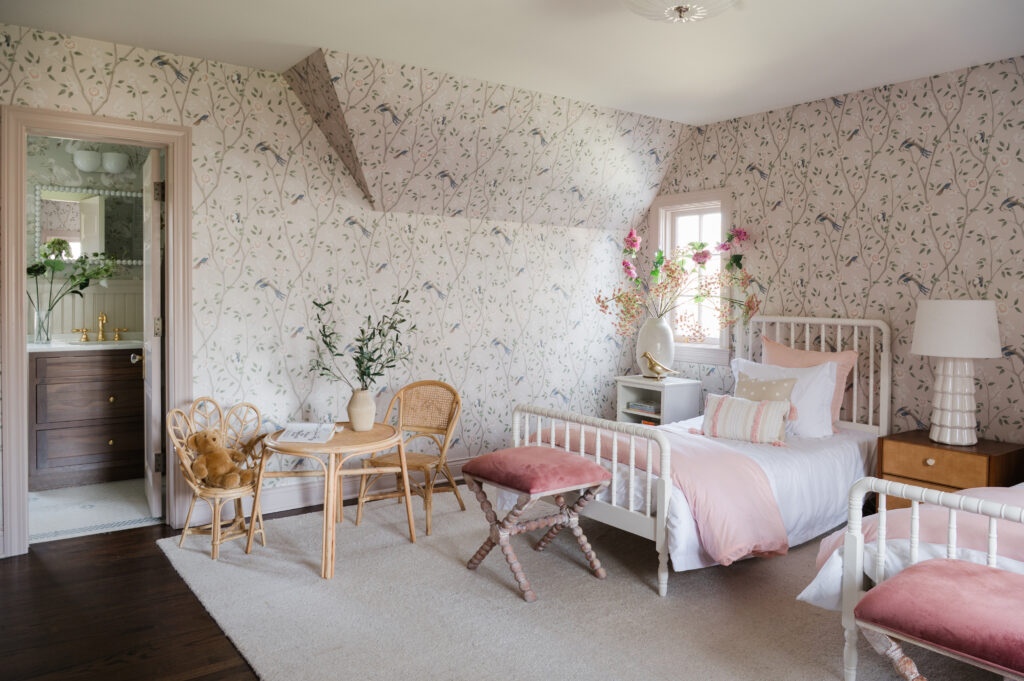
Design Highlights:
- Floor-to-ceiling statement wallpaper
- Color-matched moulding for a seamless look
- Spa-inspired ensuite with calming finishes
- Earthy neutrals with soft fabrics and florals
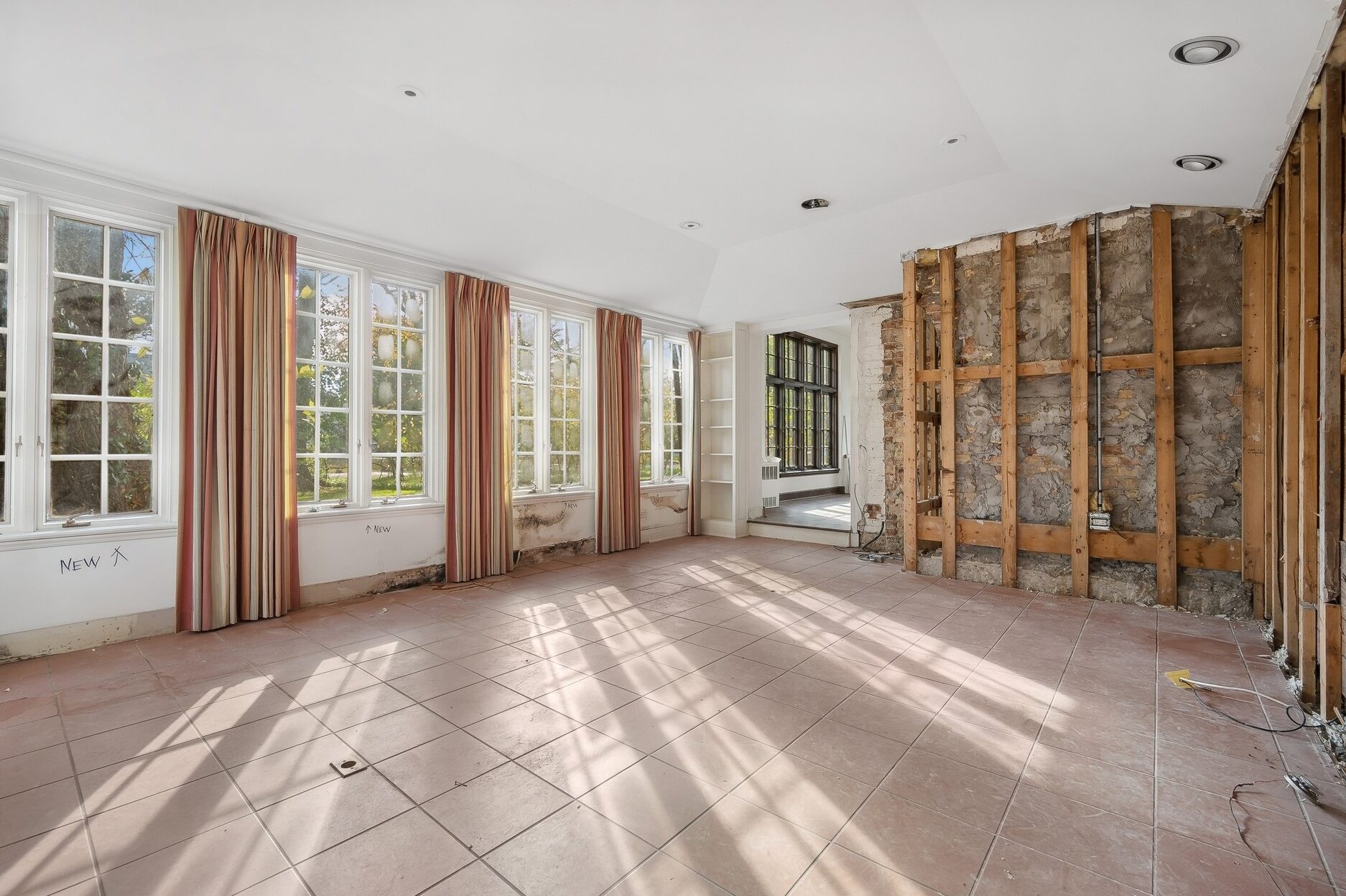
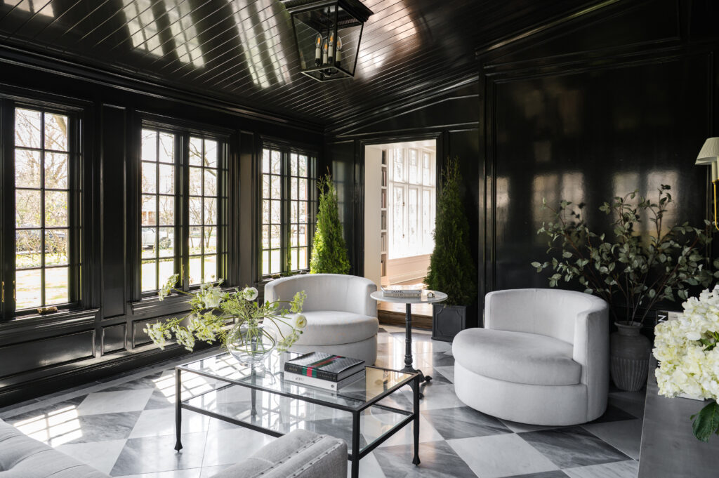
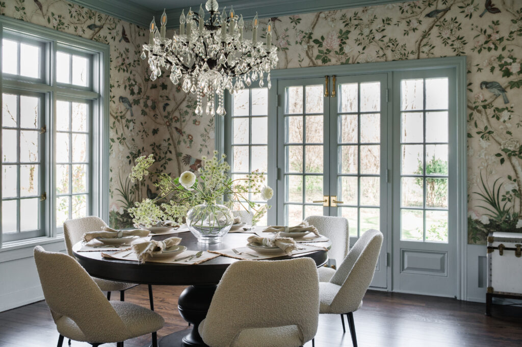
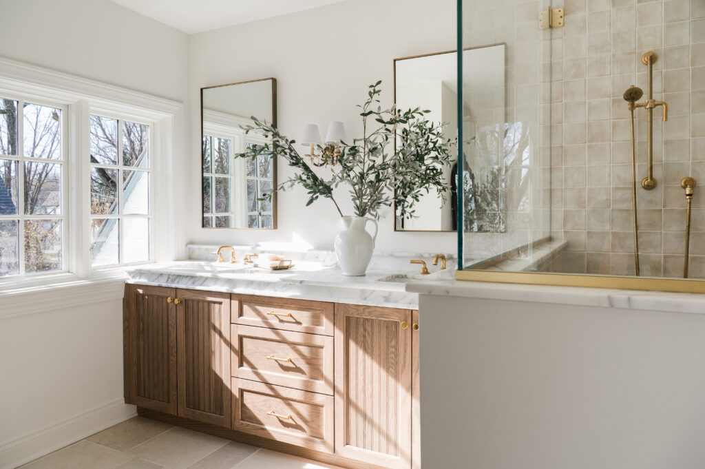
Additional Transformations

A Personal Note: Why We Did It
As someone who lives and breathes real estate, and, design, it was easy to put our own project on the back burner. But once we started, we realized how transformative it is to live in a space that’s thoughtfully designed for you. Every decision we made, from fixtures to flow, was grounded in how we wanted to live, feel, and recharge at home.
We got was a home that reflects everything we believe in: clean lines, natural materials, functional flow, and spaces that quietly inspire.
Thinking About Your Own Renovation?
Whether you’re planning a complete renovation or just feel like your space doesn’t reflect who you are, we’re here to help. Our own experience taught us that great design goes beyond looks—it’s about creating spaces that truly improve how you live, one room at a time.
Reach out if you’re ready to reimagine your space!
+ view the comments