I’ll never forget standing in a client’s freshly painted foyer as the late afternoon sun poured in, only to realize the walls looked completely different than they had that morning. Not only was the white warmer than expected, but the light was bouncing off the walls like a spotlight at a fashion show. The culprit? The wrong sheen.
If you’re picking the perfect white, here’s a truth I’ve learned over years of design work: undertone gets all the attention, but sheen does a lot of the heavy lifting.
In this guide, I’ll walk you through my favorite white paints, and tell you exactly what sheen to use for walls, trim, and ceilings to get that designer-level finish.
Let’s Talk Sheen First
Before we dive into colors, here’s a quick breakdown of my go-to sheens in any white-paint situation:
- Walls: Eggshell – Just enough sheen to reflect a soft glow, but matte enough to hide minor imperfections.
- Trim & Doors: Semi-gloss or satin – For durability and that crisp, clean contrast against matte walls.
- Ceilings: Flat – No reflection, no fuss, just a quiet surface above that keeps attention on the space.
Go-To White Paint Colors
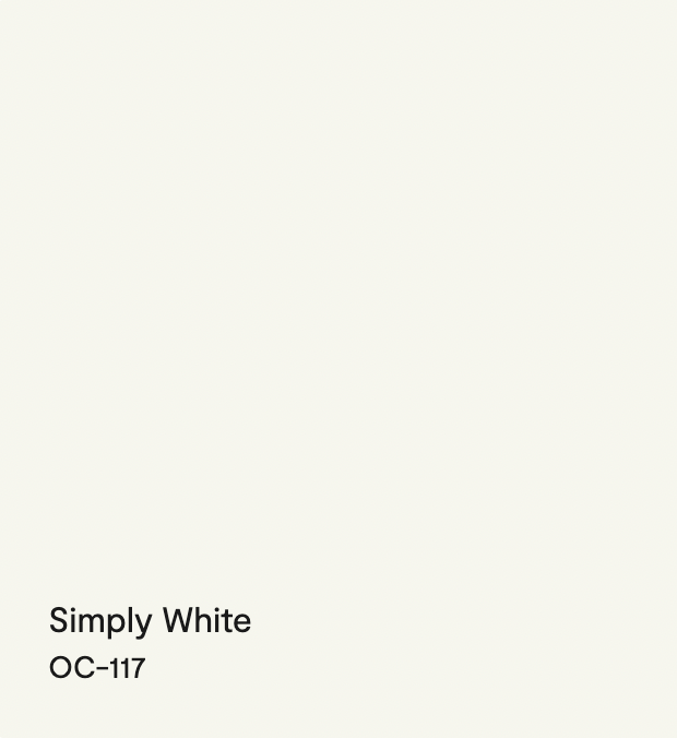
1. Simply White – Benjamin Moore
- Undertone: Slightly warm
- Personality: Clean, happy, bright
- Best Sheen Combo: Eggshell on walls, semi-gloss on trim, flat on ceiling
Simply White is a favorite for a reason, it’s versatile and fresh without being cold. I use it in family homes where natural light is generous and the vibe is energetic. It’s an especially great white for kitchens or open floor plans.
Designer Tip: If you’re pairing with cooler finishes like chrome or white marble, the warm undertone softens the space beautifully.
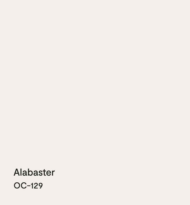
2. Alabaster – Sherwin-Williams
- Undertone: Warm and creamy
- Personality: Soft, classic, calming
- Best Sheen Combo: Eggshell on walls, satin on trim for a soft glow, flat on ceiling
Alabaster is my go-to for older homes, craftsman bungalows, and anyone craving a “hug in a color.” It’s gentle, grounded, and plays well with earthy tones or rustic wood.
Designer Tip: In low-light rooms, this warms everything up without turning yellow.
3. Schoolhouse White – Farrow & Ball (exterior favorite)
- Undertone: Subtle grey with a warm base
- Personality: Heritage, grounded, understated
- Best Sheen Combo (interior use): Estate Eggshell on walls, Estate Satin on trim
While I use this most often on exteriors, it’s equally beautiful inside for a cozy, lived-in look. It has more depth than your standard white and is perfect for libraries, mudrooms, or cottages.
Designer Tip: If using outside, pair it with dark bronze, olive green, or light blue trim for a sophisticated contrast.

4. White Dove – Benjamin Moore
- Undertone: Warm with a whisper of gray
- Personality: Timeless, flexible, serene
- Best Sheen Combo: Eggshell on walls, semi-gloss on trim, flat on ceiling
This is the white I use when I want everything to feel soft and pulled-together but not stark. It looks gorgeous in transitional homes and is a dream for art walls, it lets other elements shine.
Designer Tip: Especially forgiving in homes with inconsistent natural light.

5. Slipper Satin – Farrow & Ball
- Undertone: Warm, chalky beige
- Personality: Elegant, tailored, understated
- Best Sheen Combo: Modern Eggshell on walls, Estate Satin on trim, flat on ceiling
Despite the name, this isn’t a high-sheen paint, Slipper Satin refers to the color, not the finish. And what a color it is. With just a hint of creamy warmth, it’s ideal for traditional interiors that want a sophisticated but soft backdrop. I’ve used it in formal dining rooms and even master suites, it wraps a room in quiet luxury.
Designer Tip: Looks incredible with antique brass hardware or layered neutral textiles.

6. Swiss Coffee – Benjamin Moore
- Undertone: Creamy, with a hint of greige
- Personality: Cozy, warm, lived-in
- Best Sheen Combo: Eggshell on walls, satin on trim, flat on ceiling
Swiss Coffee has a slightly deeper, richer undertone than the others on this list. It gives a room soul, perfect for older homes or spaces where stark white would feel too cold. I love using this in homes with stone fireplaces or wood beams.
Designer Tip: Skip this in north-facing rooms unless you want it to skew very warm.

Final Thoughts: Don’t Just Pick a Color—Pick a Mood
Choosing the right white paint is about knowing the story your space wants to tell. But don’t stop at the swatch, sheen is what makes that story come alive. A glossy trim can make your molding sing. A matte ceiling can vanish into the background. And just the right eggshell wall finish can take a flat room and turn it into something luminous.
So test it. Paint it. Live with it for a few days. And remember, white might look simple, but it’s never basic.
+ view the comments