

Sunday Strategy usually opens with a long story before I get to the point.
Not today.
Something has happened.
My husband, a man with whom I co-own a design firm and real estate team, picked up a fan of my white paint samples this week and called them “white.”
All of them.
One word.
If it can happen in my house, it can happen in yours. So this morning I am skipping the story and going straight to the evidence.
They are not all white. Let’s go.
My Farrow & Ball Paint Guide
The colors I keep coming back to, the finishes I actually use, and why sheen matters more than you think.
A NOTE BEFORE WE START…
This is not every Farrow & Ball color I like. It is the short list of the ones I use over and over, and more importantly, how I use them. Because the color is only half the decision. The finish matters. The light matters. The floor beside it and the stone you already ordered matter.
Two things you should know about me before we begin, because they explain almost everything below:
I am firmly in the color-drenching camp. And when in doubt, I want a little more sheen, not less.
I love old houses, heavy millwork, cabinetry that feels like furniture, and doors that deserve to be looked at.
I want paint to help you see those things, not flatten them.
WHY FARROW & BALL
I know. Paint is paint. Except it isn’t.
Benjamin Moore and Sherwin-Williams make very good paint and I use both on plenty of projects. But when the paint itself is doing real design work in a room, I usually reach for Farrow & Ball, and yes, it costs more. Two reasons.
The color moves. Farrow & Ball colors have enough complexity that they change with the light. A blue goes a little greener in the afternoon. A neutral warms up at dusk. A dark color keeps you guessing whether it’s blue, green, gray, or black. That movement is what makes a room feel layered instead of flat, and it matters most in exactly the rooms I design, where one color is covering walls, trim, cabinetry, and sometimes the ceiling.
The finishes work as a system. I can put one color on the walls in a soft matte, carry it onto the trim in something glossier, and take a door or a run of cabinetry all the way to Full Gloss. Same color, three different relationships with the light. That is most of how I design.
This is also why I don’t recommend taking a Farrow & Ball chip to another brand and asking them to match it. They’ll get close to the little square on the card. But you’ve changed the pigments, the binders, the base, and the sheen, so you won’t get the way the color behaves across a whole room. And the behavior is the part I’m paying for.
Do you need it in the basement utility closet? No. Do you need it when paint is one of the main materials in the room? For me, yes.
And since I know the difference in price is real: if you order your Farrow & Ball through us, code KHxFB10 takes 10% off orders of $100 or more, on every color, primer, and archive shade we carry, in every finish, as many times as you like. Consider it my expensive opinion, slightly discounted.
THREE PAINT RULES
1. Sample the room, not the chip. Paint changes with light, and your floors, stone, tile, and upholstery are all throwing color back at the walls. Get large samples, put them on more than one wall, and look at them in the morning, in the afternoon, and at night with the lights on. Please do not choose a whole house from a two-inch square under showroom lighting.
2. White is a color. Some whites go yellow. Some go pink, gray, or green. Some feel chalky and old, some crisp and architectural. And the same white can behave completely differently in two houses. This is why I have so many. (See: my marriage.)
3. I rarely want bright white trim floating around a colored room. There are rooms where contrast is beautiful. But I don’t automatically outline every doorway, baseboard, and casing in white, especially in an old house. If the architecture is good, I want the walls, trim, and doors to relate to each other instead of chopping the room into pieces.
Which brings me to the thing I actually want to teach you today.
COLOR DRENCHING IS NOT ONE FINISH EVERYWHERE
This is the most important distinction in the whole guide.
When I drench a room, I often use one color on the walls, trim, doors, and ceiling, but I change the sheen as I go. The room still feels enveloping and whole, but it isn’t flat. The casing catches light. The doors have presence. The millwork suddenly looks substantial.
You don’t need a second color to show off good architecture. Sometimes you just need the same color to catch the light differently.
SHADES OF WHITE
Or, as KC calls them: white, another white, slightly darker white, sort of gray white, another white.
Here are the ones worth arguing about.
Wimborne White No. 239 My clean-but-not-stark white. Reads unmistakably white with enough warmth to keep it from feeling clinical. I use it for bright rooms and traditional architecture, on walls and millwork together. Like any warm white, sample it beside your stone and flooring before you commit.
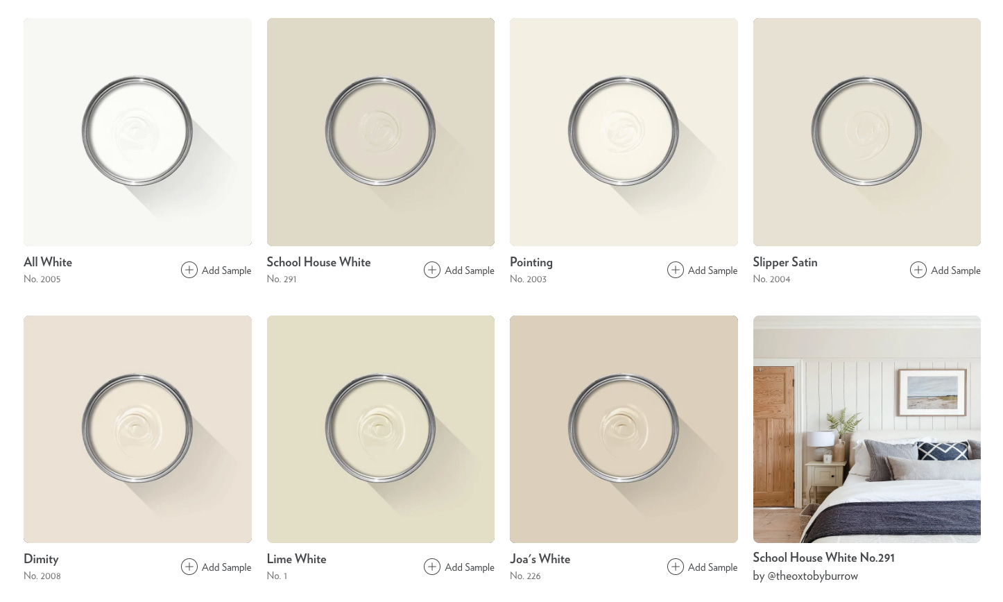
Pointing No. 2003 Creamier and softer. Pointing makes a room feel a little less new, and I mean that as a compliment. Beautiful with old wood, antiques, and warmer stone. My pick for historic homes and rooms that want softness more than brightness.
School House White No. 291 The white I use when I don’t really want the room to feel white. Quiet, a little aged, and it belongs to old architecture in a way a cleaner white often doesn’t. Walls and millwork together, bedrooms, living rooms, anywhere with a lot of texture.
Shaded White No. 201 Where white starts heading toward stone. A pale neutral that never reads creamy. Excellent with limestone, old wood, and warm metals, and in rooms where a traditional white feels too precious.
Slipper Satin No. 2004 Soft, chalky, and very easy to live with. It isn’t trying to be the brightest thing in the room, which is exactly why I like it. Antiques, stone, warm woods, traditional rooms.
Now, why so many? Because “white” isn’t a decision. It’s about four thousand decisions. A white with a yellow undertone does one thing beside a walnut floor and a white with a gray undertone does something else entirely, and a warm white next to Calacatta can pull a color out of the marble you never noticed. The right white isn’t the one winning on Instagram. It’s the one that behaves in your room.
So yes, KC. We need all of them.
THE WARM NEUTRALS
I like a neutral that knows it’s a color. Not beige or gray chosen out of fear, but something with enough depth to relate to the materials around it and give you somewhere to go.
Skimming Stone No. 241 Somewhere between warm gray and stone. Quietly makes everything around it look better. Whole rooms, calm bedrooms, and anywhere white feels too bright.
Drop Cloth No. 283 A great old-house neutral. Warm, earthy, and substantial without taking over. Historic architecture, plaster, natural wood, kitchens.
Joa’s White No. 226 Warm and enveloping, with far more presence than a typical off-white. For when the goal is cozy rather than light and bright.
Mouse’s Back No. 40 When a neutral becomes a real color. Has weight. Millwork, cabinetry, libraries, mudrooms, and rooms with a lot of architectural detail.
London Clay No. 244 Deep, earthy, moody. I would much rather use this on purpose than an anonymous mid-beige because I couldn’t decide. Dining rooms, libraries, cabinetry.
THE BLUES
Farrow & Ball does blues well because so few of them are simply blue. There is gray or green in there, and enough depth that they shift all day.
Light Blue No. 22 A historic blue that isn’t precious. Muted and very livable, and depending on the light it drifts toward blue-green-gray, which is far more interesting than baby blue. Bedrooms, bathrooms, cabinetry.
Oval Room Blue No. 85 More body and saturation than Light Blue without going dark. Dining rooms, libraries, and rooms with substantial trim.
De Nimes No. 299 Denim without being denim-themed. Muted, sophisticated, easy to layer. Cabinetry, offices, bedrooms.
Hague Blue No. 30 The “we are committing” blue. Don’t use it timidly. Give it millwork, give it paneling, give it the whole room.
THE GREENS
I have a very high tolerance for green. Muddied enough, it behaves almost like a neutral, particularly in old houses, and it loves aged brass, walnut, oak, stone, and antiques. Which is basically everything I love.
Pigeon No. 25 The gateway green. If green makes you nervous, start here. Soft, muted, easy. Cabinetry, mudrooms, millwork.
French Gray No. 18 Proof that paint names should not be trusted. It says gray. It is green, and it changes enormously with the light. Whole rooms, cabinetry, garden rooms.
Card Room Green No. 79 Historic without being theatrical. Restrained, and best when it gets the whole room rather than an accent. Libraries, dining rooms, offices.
Treron No. 292 Earthy and strong enough to stand up to heavy wood, stone, and aged metal. Cabinetry, millwork, mudrooms.
THE PINKS, PLASTERS + EARTHY REDS
Not the bubblegum section. These are muddy, earthy colors that happen to contain pink or red. Think plaster, clay, and terracotta.
Setting Plaster No. 231 The pink for people who insist they don’t like pink. Warm, soft, and beautiful with wood and aged materials. Bedrooms, dressing rooms, sitting rooms.
Sulking Room Pink No. 295 Dustier and more grown-up. Rewards commitment, so drench it. Bedrooms, libraries, dining rooms, anywhere you want warmth without sweetness.
Dead Salmon No. 28 Terrible name, very good color. Lives somewhere between brown, pink, and old plaster, which makes it far more versatile than it sounds. Older homes, bedrooms, powder rooms, dark wood.
THE YELLOWS
I edit this section hard because yellow goes wrong fast. I want a yellow that came from the earth or an old house, not a box of crayons.
Hay No. 37 Muted and earthy. Warmth without the room shouting YELLOW. Kitchens, breakfast rooms, bedrooms that need a little borrowed sunshine.
Sudbury Yellow No. 51 Traditional and warm, with an old-house feeling. Historic homes and rooms that naturally run dark.
Babouche No. 223 The brave one. Sometimes a room wants actual color, and this is a design decision, not a background. Small rooms, joyful rooms, furniture.
DARK & MOODY
Almost-blacks, browns, and the moody ones. I would nearly always rather use a complex near-black than a pure one. The undertone gives it depth and makes it easier to layer.
Railings No. 31 My alternative to hard black, with a blue quality underneath that gives it dimension. Doors, windows, millwork, cabinetry, exterior accents.
Off-Black No. 57 For when I want something to read black without being harsh. Doors, trim, cabinetry, dramatic rooms.
Down Pipe No. 26 The happy place between black and gray. Dramatic without every application becoming A Black Room. Cabinetry, exteriors, doors, mudrooms.
Tanner’s Brown No. 255 Deep, rich brown. Brown is having a moment, though I’d argue good brown never left, especially in historic interiors. Libraries, studies, millwork.
NOW, FINISH & SHEEN
Most people spend weeks on the color and about fourteen seconds on the finish. I’d like to redistribute some of that energy, because sheen changes how you see the color, how light moves through the room, and how the architecture reads.
My general philosophy: when in doubt, a little more sheen rather than less. Not everywhere. But doors, cabinetry, and substantial millwork should catch the light, especially in a drenched room.
Dead Flat Very matte, soft, and chalky. It can go across walls, ceilings, and woodwork, which makes it the finish for a truly seamless drench. Beautiful. But because I like watching the architecture shift as the light hits it, I don’t default to Dead Flat on everything just because I’m drenching. Sometimes the contrast I want is in sheen, not color.
Modern Emulsion My workhorse wall finish. Still reads matte, but built for kitchens, bathrooms, hallways, and family spaces. If sheen on your walls makes you nervous, this is a very comfortable place to land.
Estate Eggshell The lower-sheen option for trim, doors, millwork, and cabinetry. Durable, restrained, with a subtle glow. Lovely. But if the architecture deserves attention, I usually go one step glossier.
Modern Eggshell THIS. Now we’re speaking my language. Enough sheen that you notice the light on the casing, the door profile, the baseboard. This is one of my favorite ways to drench: same color on walls and trim, different finish, and suddenly the room has architecture without anything being outlined in white.
Full Gloss Commitment. Done well it is extraordinary: incredible depth of color, real reflection, and an ordinary door starts to feel like part of the decoration. I love it for statement doors, special millwork, cabinetry, and small dramatic rooms. But gloss is unforgiving. Every dent, patch, and sanding mark will introduce itself. If you’re going glossy, prep is part of the design.
MY DEFAULT DRENCH FORMULA
If I’m running one color through a room, I usually start here and adjust:
Walls: Modern Emulsion. Soft enough to read as a wall, tough enough for real life.
Trim + doors: Modern Eggshell. Enough sheen to let the architecture catch the light.
Ceiling: the same matte wall finish, unless I want the ceiling to do something specific.
Special moments: Full Gloss. A door. Built-ins. The wet bar. The powder room. Something that deserves a little drama.
The point isn’t that everything matches. The point is that everything relates. I don’t want the trim to contrast with the walls. I want it to catch the light differently. If you’ve ever painted a room a color and then felt obligated to paint every piece of trim bright white because that’s what you’re “supposed” to do, look again. Maybe the room doesn’t need another color. Maybe it needs another finish.
IF YOU DON’T KNOW WHERE TO START
Start with the architecture, not Pinterest. Your house is already telling you things.
Look at the light (warm southern, cool northern, almost none). Look at the floors (orange, red, gray, pale, dark). Look at the stone, especially if it’s already installed; your marble has undertones, I promise. Look at the woodwork, the age of the house, and the rooms next door, because you don’t choose colors in isolation.
Then ask what you want the room to feel like. Bright, quiet, warm, moody, cocooning, formal, fresh? That is a much more useful question than “what’s the best white?” There isn’t one. Sorry.
BEFORE YOU BUY FIVE GALLONS
Sample. I know nobody wants this answer. You want me to say “order Wimborne White and go live your life,” and some days I would love to. But too many things affect paint for me to promise a color will work in your house because it worked in mine.
Get the sample. Make it big. Move it around. Look at it beside the floor and the stone, in daylight and after dinner with every light on. And if you hate the first one, that’s not failure. That’s exactly why we sample.
One last word on sheen: there’s a tendency right now to assume sophisticated means matte. I don’t agree. A matte wall is beautiful. So is a glossy door, a lacquered room, a softly reflective run of cabinetry. Rooms get interesting when every surface isn’t treated the same way, and old houses hand you a hundred chances to let light do some of the work. Don’t be afraid of sheen. Just use it on purpose.
THE TLDR - SAVE THESE
Shades of White: Wimborne White, Pointing, School House White, Shaded White, Slipper Satin Warm neutrals: Skimming Stone, Drop Cloth, Joa’s White, Mouse’s Back, London Clay Blues: Light Blue, Oval Room Blue, De Nimes, Inchyra Blue, Hague Blue Greens: Pigeon, French Gray, Card Room Green, Green Smoke, Treron Pinks + earthy reds: Setting Plaster, Sulking Room Pink, Dead Salmon, Red Earth Yellows: Hay, Sudbury Yellow, Babouche Dark & Moody: Railings, Off-Black, Down Pipe, Tanner’s Brown
A LITTLE GIFT FOR YOUR PAINT ORDER
Ready to stop staring at the sample?
Shop Farrow & Ball through our website and use code KHxFB10 for 10% off your order of $100 or more. It works on every color, primer, and archive shade we carry, in every finish, with no limit on how many times you use it. So it’s just as good for the one wall you’ve been circling for six months as it is for the whole-house repaint.
Pick your colors. Choose your finish. Add KHxFB10 at checkout. We’ll take it from there.
And if your spouse tells you they’re all the same white: remain calm. You now have supporting documentation.
xo, Grace
P.S. Everything above is really one lesson in a paint-colored costume: the decisions that make a house work get made before anyone picks up a brush.
That is the whole idea behind The Design Office, my seven-week live course on how I actually think through a house, from what the house wants to be all the way down to which room gets the Full Gloss door.
I’ll share my downloadable project plans, schedules, templates, decision-making tools, and the systems we use to take a house from a pile of ideas to a beautifully-designed home.
It is NOT a DIY course. It is NOT a contracting course. It IS a course in how to lead your renovation well, make the big decisions in the right order, understand what your team needs from you, and become the person confidently designing and running the project instead of reacting to it.
In other words: from “I think I can do this” to “I am actually the CEO of this project.”
Class is currently in session, but you can join the waitlist below to be the first to know when enrollment opens again!